
Client
Bliss Pediatric Dentistry
Scope of Work
Branding + Website Design
Brand Goals
Playful / Minimal / Professional

Bliss Pediatric Dentistry was getting ready to open their doors in Northern California — a fresh, family-focused dental practice with something special already built in: a real garden outside for the kids. They came to me knowing they needed a brand that could communicate all of that warmth and wonder from the very first impression, online and off.


Before coming to me, the Bliss team had tried to piece together their own website — which is completely understandable when you're in the middle of launching a whole practice. But the result was a brand that felt inconsistent and unpolished, without a clear visual identity tying everything together. For a pediatric dental office, first impressions matter enormously. Parents are making trust decisions fast, and a disjointed online presence was getting in the way. On top of that, the existing site wasn't built with search engine optimization in mind, which meant they were essentially invisible to the local families they most needed to reach.
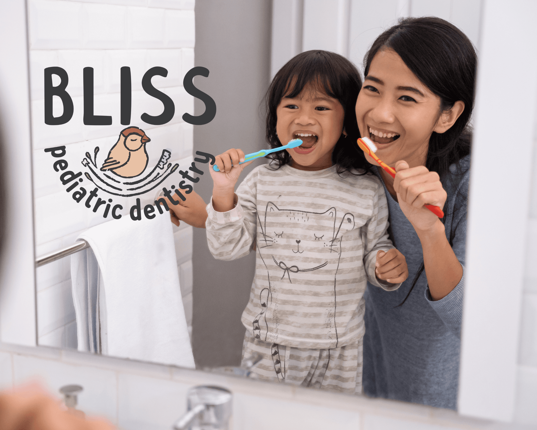
My approach had two layers. First, the brand: I developed a custom illustration system rooted in the garden that makes Bliss so unique. Kid-friendly, playful, and full of life — the kind of visuals that make a child excited and a parent feel like they've found the right place. The illustrations gave the whole identity a through-line, something consistent and ownable that no template could replicate. Second, the build: I designed and developed the full site in WordPress using Bricks Builder, specifically chosen for its SEO flexibility. That meant clean code, fast load times, and a structure built to rank well in local search — so when a Northern California family searches for a pediatric dentist, Bliss has a real shot at being the first name they see.


